Launch Parameters
Orbital Mechanics / Data Viz | 2023
Launch parameters in one click from Earth.
Sole engineer and product designer, responsible for the orbital physics engine, TypeScript web rebuild, 3D globe interaction, dashboard-ready exports, visualization layer, and Power BI support package.
Concept originally prototyped as a Python CLI toolkit in 2022 during undergrad. Reconstructed, expanded, and ported to a full interactive web app in 2026. Current status: shipped locally, ready for GitHub publication.
React + Vite web app backed by a TypeScript physics engine. The globe is rendered with Three.js / react-three-fiber / drei using a NASA Blue Marble texture. Live elevation comes from the Open-Meteo Elevation API; reverse geocoding from OpenStreetMap Nominatim. The v1 toolkit is pure Python with matplotlib and Power BI export support.
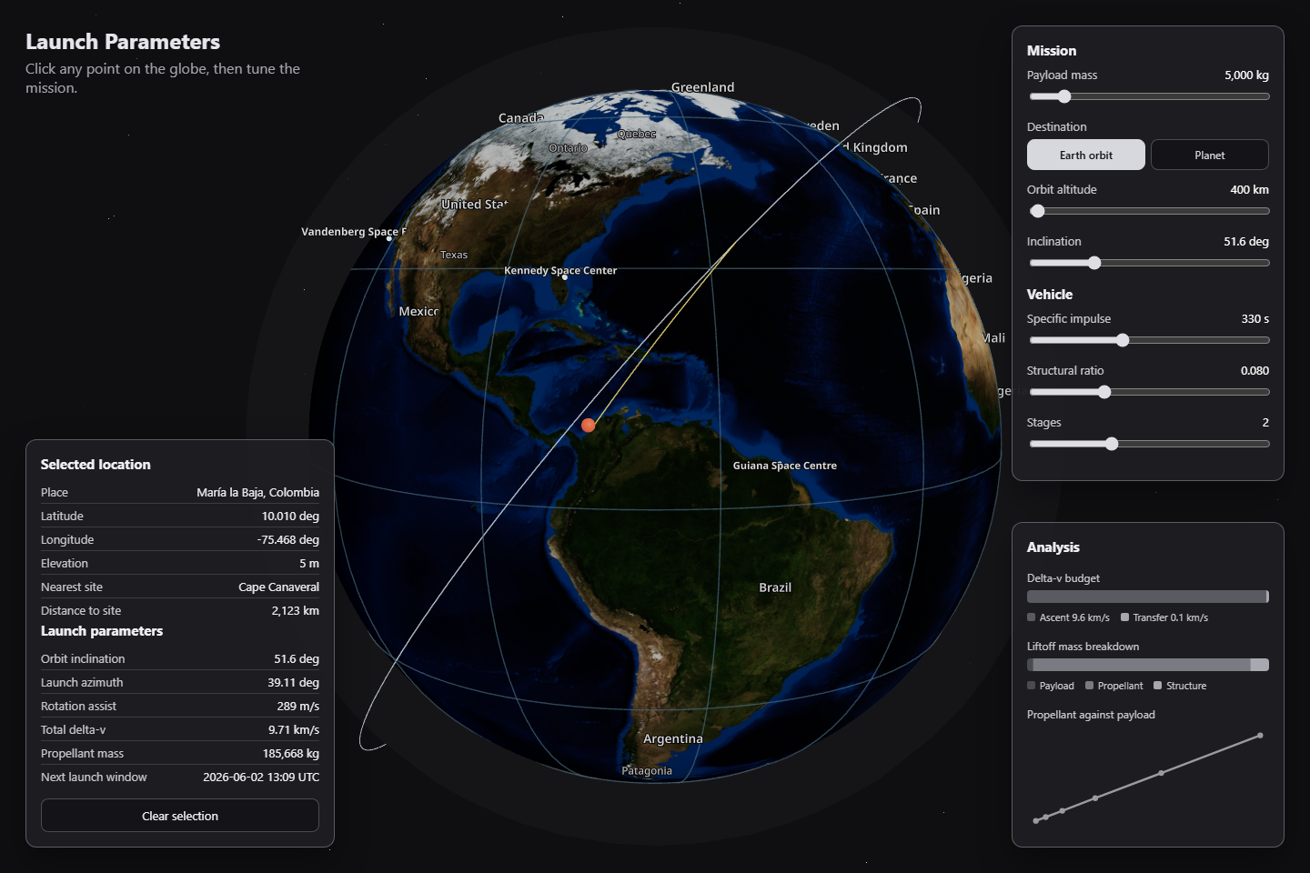
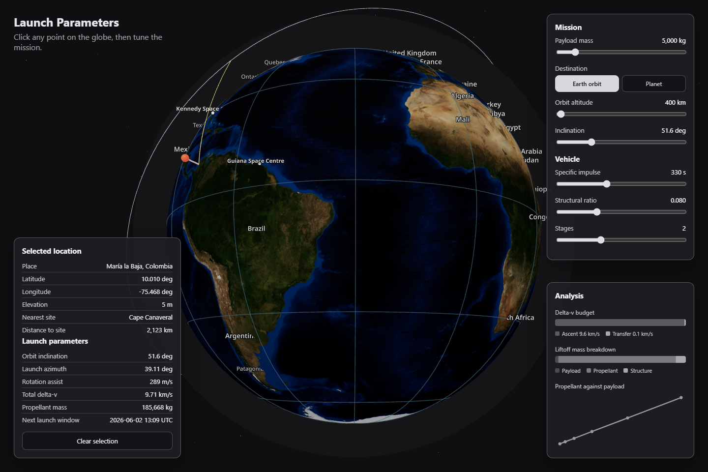
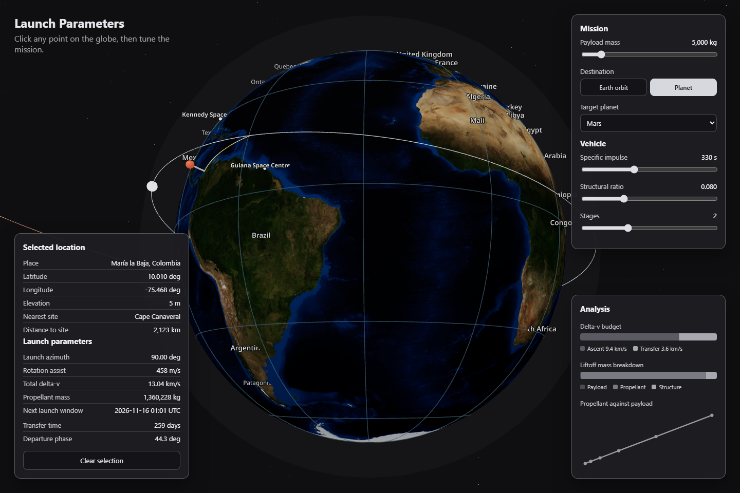
Launch Parameters is an interactive launch-planning tool where a user clicks any point on Earth and gets mission parameters for reaching orbit or departing toward another planet. It estimates launch azimuth, rotation assist, delta-v, launch windows, propellant mass, and trajectory geometry from the chosen location, payload, destination, and vehicle configuration. The project started as a dashboard-style analytics concept and became a hostable web app because the key experience needed to be spatial: pick a real place, see the Earth, and understand why geography changes the launch.
Any point on Earth, a live orbital estimate.
Launch Parameters turns an arbitrary point on Earth into a live orbital mission estimate, combining a physics engine, 3D globe, dashboard charts, and open geospatial data. Click a coordinate, get launch azimuth, rotation assist, delta-v budget, propellant mass, and launch window, without touching a form.
Geography is the missing variable in launch math.
Before this project, the original dashboard idea had a common problem: the analysis could work, but the interface was too abstract. A launch site is not just a dropdown. Latitude, longitude, elevation, Earth rotation, orbit inclination, and destination geometry all matter. A static dashboard can show the outputs, but it does not make the user feel the geography. The gap was an interface that connected the physical Earth to the math.
“Horizons provides programmatic access to solar-system ephemerides, which validates the need for public planetary data in mission-planning tools.”
“The API accepts latitude/longitude and returns terrain elevation, directly matching the project need to enrich arbitrary click points with elevation data.”
“Nominatim finds a nearby suitable OSM object rather than a perfect address for the coordinate, shaping the 'rough demographic area name' behavior.”
“Near-global elevation datasets like SRTM show that terrain-aware launch estimates can be built on open data instead of proprietary map services.”
“I don't just need the lat and long; I also need the rough demographic area name. The elevation also matters.”
Five constraints, one spatial product.
Five iterations to make geography feel like physics.
The computation core (Python v1).
The first rebuild focused on the engine rather than visuals: Python modules for Earth rotation assist, vis-viva, Hohmann transfers, launch windows, rocket equation staging, validation, CLI output, CSV exports, and matplotlib charts. The weakness was obvious: it was accurate and dashboard-ready, but it did not yet feel like the spatial product the concept needed.
Web foundation and the first globe.
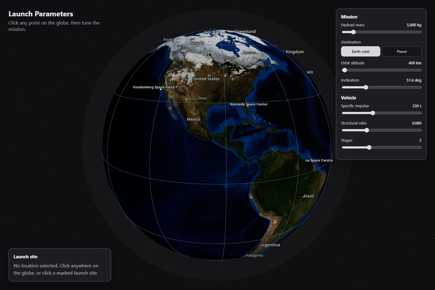
The physics was ported to TypeScript and wrapped in a React/Vite app. The first globe was too plain, almost a blue sphere with dots. That changed after feedback: "I don't see Earth, I only see a blue colored globe." The fix was a real NASA Blue Marble texture, launch site labels, country/region/city labels, collision spacing, and a click-to-pin interaction.
Exact-point mission planning.
Initially the globe mostly showed the nearest launch site. That missed the core idea. The pivot was to compute launch parameters for the exact clicked coordinate, while still showing the nearest cataloged site as reference. Any coordinate now drives the full physics engine.
Usability polish: labels vs panels.
Several visual bugs came from the Three.js/drei HTML label layer fighting with the HUD panels. Labels covered controls, panels looked missing, and the pin scaled oddly at different zoom levels. The fix was stacking-context isolation, opaque panels, click-vs-drag detection, constant screen-size pin scaling, and label collision filtering.
Dashboard completion.
Mission controls, trajectory rendering, analysis charts, live elevation, place-name lookup, and hosting setup were added as feature branches. At that point the app stopped being a globe demo and became a usable launch dashboard.
The surprising part was that the hardest polish work was not orbital mechanics. It was interface layering: drei HTML labels, WebGL canvas transparency, panel stacking, and label collision all made the app feel either broken or polished depending on z-index. Several hours of debugging were spent on rendering, not physics.
A plain blue sphere with dot markers. No texture, no labels, no sense of actual Earth geography.
Real NASA Blue Marble texture, graticule, launch site labels, country/region names, and collision-filtered city labels.
Clicked point mostly referenced a nearby cataloged launch site. The selected coordinate itself was not the computation input.
The clicked lat/lon drives the full physics engine. Live elevation and place name enrich the point. Nearest site shown as reference only.
Drei HTML labels leaked over the mission control panels. Controls were partially hidden and the layout felt broken.
Labels live behind the HUD via stacking-context isolation. Label collision logic thins out crowded areas. Panels are fully opaque and always accessible.
Mission control HUD over a real Earth.
The key branded moment is a grey mission-control HUD over a real Earth, with a small pin, graticule, labels, and trajectory overlay. It should feel operational and technical, not like a landing page. Dark panels with monospace readouts, a real Earth texture, and muted accent colors keep the aesthetic grounded in aerospace tooling.
Inputs
  lat · lon · elevation
  payload · vehicle
  destination

↓
Rotation assist
  (Earth surface speed)
Launch azimuth
  (orbital inclination)
Orbit velocity
  (vis-viva equation)
Ascent losses
  (gravity + drag est.)
Transfer delta-v
  (Hohmann)
Propellant mass
  (Tsiolkovsky / staging)
Static catalogs
  planetary data
  launch site list

Open-Meteo API
  elevation lookup

Nominatim API
  place name lookup

↓ TypeScript mission solver ↓

UI panels
  location · mission · analysis

Globe overlays
  pin · trajectory · labels

Export
  CSV · Power BI
No selection
  globe idle · labels visible

Click detected
  pin dropped
  live data loading

Earth orbit selected
  orbit ring rendered
  budget computed

Interplanetary selected
  escape path rendered
  transfer window shown

Live data unavailable
  fallback gracefully
  mission still computes
The Analysis panel surfaces the physics pipeline as a readable briefing: a delta-v budget bar, the liftoff-mass breakdown by stage, and a propellant-vs-payload sweep. Every value traces back to the same engine that the v1 Python toolkit validates against its 46-test suite.
What shipped: orbit and interplanetary, in two frames.
The product shipped as a hostable single-page web app. The earlier sections already covered the default globe, the selected-location dashboard, the analysis panel, and the mission-control panel; what follows are the two frames that close the story: a trajectory close-up and the interplanetary mode.
What worked, what I'd ship differently.
Worked
Keeping the Python toolkit as the validated analytics base while building the TypeScript web app as a separate product meant both could evolve independently. The v1 tests validated the physics before anything was rendered.
Starting with 'pick a place on Earth' instead of 'fill out a form' made the project far more memorable than a normal dashboard. Geography as the primary UI was the right call.
Foundation → globe → mission controls → trajectory → charts → live data → hosting → visual fixes. Each branch was reviewable on its own and kept the rebuild readable even as scope grew.
Would change
Panels accumulated around the globe organically, which caused the layering bugs in Iteration 4. A HUD layout spec from the start would have prevented several hours of z-index debugging.
A single Earth texture works well and avoids paid API dependencies, but it is not Google Earth-level zoom. That trade-off should be a day-one decision, not a late discovery.
Several bugs were caused by WebGL/HTML layering rather than physics. A dedicated rendering-debug mode from the start would have surfaced those faster.
The hardest part was not orbital mechanics. It was interface layering. Drei HTML labels, WebGL canvas transparency, panel stacking, and label collision made the app feel either broken or polished, and the difference between the two was entirely in rendering code, not physics. The math was the easy part.
StatusShipped locally. All tests passing. Production build verified at 1.04 MB JS. Ready for GitHub publication (no third-party API keys required for core physics; live elevation and place-name lookups degrade gracefully if APIs are unavailable).
Not claimedThis is an educational / analytical tool. The physics is defensible but not aerospace-certified. No claims of mission-grade accuracy, live JPL Horizons integration, or Google Earth-level map tiles.